If you just want to plot data, try this: No trendline fit, just plot.
In order to do find a trendline you need:
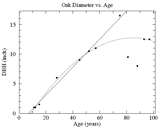
In this case the diameter of various oak trees is plotted as a function of the tree's age and two possible "trendlines" are displayed: a straight line and a quadratic curve...we mean to include various curves in our definition of "trendline". The commonly used process of determining these trendlines is called least squares fitting or regression. There are other less common options which are described here. While every measuring device has limited precision (here tree diameter measured with a tape measure and tree age measured by counting tree rings), these measurement errors are not the source of the variation in this data (instead local growth environment and genes are the likely source of the variation). Since the extent of the variation in (x,y) is unknown, we lack the usual x and y errors.
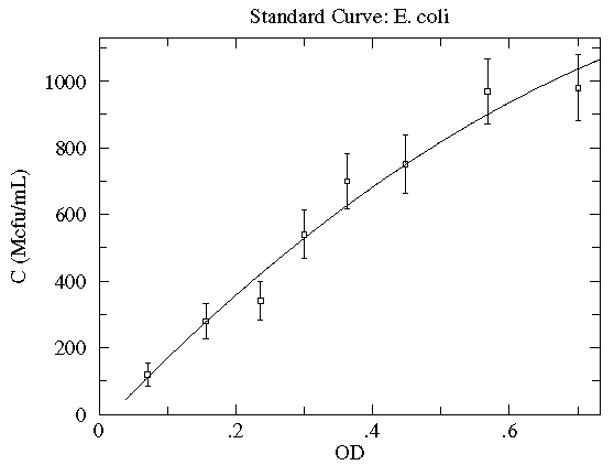
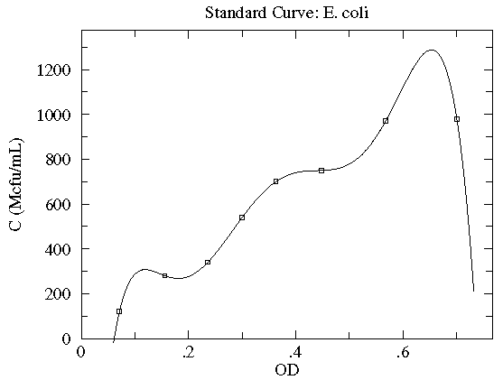
In this case the concentration of E. coli bacteria is plotted as a function of the optical depth (read: cloudiness) of the corresponding suspension. Here, in addition to the datapoints, we have an estimate of the likely variation in the y quantity. These "y-errors" (yei) are displayed as vertical error bars around each data point. Notice the curve entirely misses one error bar, and nearly misses a couple of other error bars. This is entirely expected; in fact, typically a good trendline will miss (but not by a lot) 1/3 of the error bars. [As noted elsewhere, there is no universal choice for the size of an error bar which makes this statement a bit problematic.] There is of course uncertainty in each measurement of the x quantity (optical depth as recorded on a Spectronic 20D's digital meter), but it was deemed "negligible" compared to the variation in the y quantity. [In fact the error in OD is mostly systematic and not of great relevance as long as the same equipment is always used for the measurement.] The trendline here is a quadratic:
y = A + Bx + Cx2
Very simplified theory (e.g., Beer-Lambert Law) might suggest an approximately linear relationship, and here we find a small, negative value of C improves the fit. Do notice that this fit curve would provide crazy results if applied beyond the range of the data...for example negative concentrations if OD>2.5. By displaying the fit curve along with the data we can understand the reliability of the curve within the range of the data (this is basically interpolation). How well the curve works beyond the range of the data (basically extrapolation) is at best a guess.
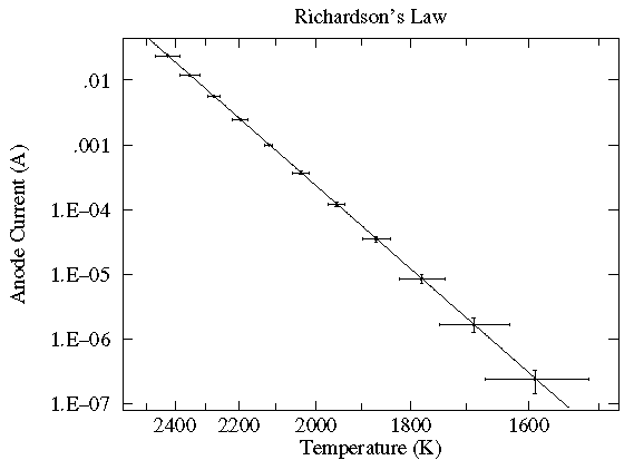
In this case the current flowing through a vacuum tube is plotted as a function of the filament temperature. Here the likely variation in both x (xei) and y (yei) are displayed as error bars. While the trendline looks like a line, a glance at the axes shows logarithmic (y) and inverse (x) scaling. In fact the trendline is an Arrhenius curve:
y = A exp(B/x)
Also notice something that should strike you as odd: the trendline goes pretty much dead center through each datapoint. The expected level of variation did not occur. While this might be a series of unlikely bull's-eyes or a blunder in determining the expected level of variation, in fact it is an example of systematic error: because of an uncertain calibration, the measured temperature may deviate from that recorded. The effect is not random; in the same situation the same temperature will be recorded: for example the meter may measure consistently high. This sort of systematic error is quite usual with most any modern measuring device. Often it does not matter; for example if you're interested in process control, it may not matter if the temperature is 25°C or 26°C just as long as it is reproducibly the same. (Of course, communication of how that process works will fail if the other guy's meter reads differently from yours.)
Finally let me stress that since every measurement is less-than-perfect, errors in both x and y is the usual case. Nevertheless, it is not uncommon for the error in one quantity to be "negligible" compared to the error in the other quantity. In this case, the usual procedure is to put the low-error quantity on the x-axis.
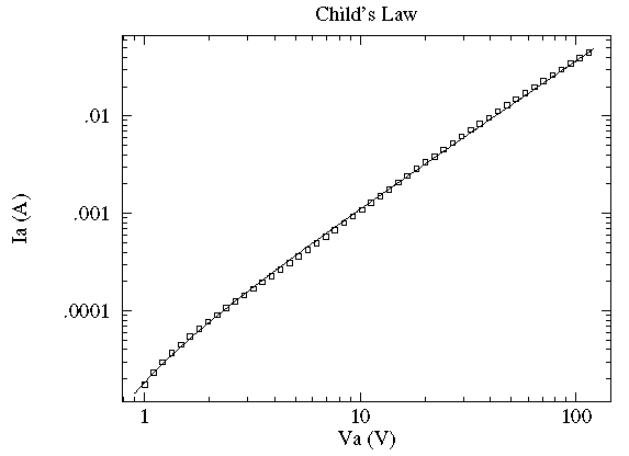
In this case the current, I, flowing through a vacuum tube is plotted as a function voltage, V, across the tube. Idealized theory predicts the relationship to be:
and the fit looks excellent. However this data was taken with 6-digit
meters; the x and y error bars are much smaller than
the plotted point (box); the fitted curve turns out to be missing essentially all
the error bars by many times the size of the error bars. In terms of the usual
measure of quality-of-fit: reduced  , this is a bad fit and idealized
theory is disproved. Nevertheless, practically speaking the curve is a fair representation of
the data. Idealized theory is "close" to the truth and the curve represents
a very useful lie. ("Foma" to Vonnegut fans). It is common in physics to
have a sequence of ever more accurate (but usually more complex) explanations
[for example: the ideal gas law, van der Waals gas law, the virial expansion].
, this is a bad fit and idealized
theory is disproved. Nevertheless, practically speaking the curve is a fair representation of
the data. Idealized theory is "close" to the truth and the curve represents
a very useful lie. ("Foma" to Vonnegut fans). It is common in physics to
have a sequence of ever more accurate (but usually more complex) explanations
[for example: the ideal gas law, van der Waals gas law, the virial expansion].
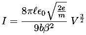
Theory in this case predicts a power law relationship:
y = A xB
While the value of A depends on variable parameters (like geometry), theory makes a definite prediction about B: B=3/2. This requirement basically comes from the dimensions of the variables: the only way the units can work out is with a particular (rational) value of B. It is fairly common for theory to require powers to be certain fixed rational values. Because of this our fitting options include fits with user specified values of B.
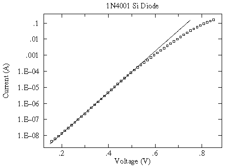
Incidentally for a modern silicon diode, simplified theory predicts an exponential relationship between current and voltage:
y = A exp(B x)
And while at first glance the relationship sure looks exponential
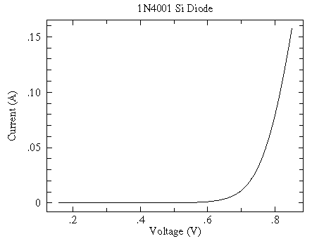
a log scale shows that the exponential relationship only holds for small V...another example of "approximate truth"
Finding useful (if only approximate) relationships is common in science and engineering. It is helpful to have a name for these "approximate truth" laws; I call them "spherical cow" laws after an old joke about theoretical physicists.
If your fitting function has as many adjustable parameters as you have datapoints, you can usually make the curve go exactly through all the datapoints. (This is an example of "N equations and N unknowns".) For example, if you have four datapoints then you can always find parameters A, B, C, D for a cubic that will exactly go through your data.
y = A + Bx + Cx2 + Dx3
Finding an N-1 degree polynomial that exactly goes through N datapoints is sometimes called Lagrange Interpolation, and it is almost always the wrong way to deal with real data. (The resulting curve usually has surprising and unlikely twists and turns.)
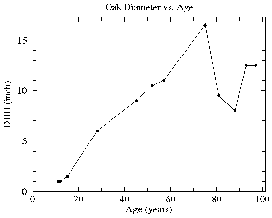
Sometimes folks will connect the datapoints with line segments. I hope they are only doing this to "guide the eye", as the discontinuous slope is unlikely to be part of reality. (Noise in the data will make what is really a smooth relationship look ragged.) The fancy name for this is Linear Interpolation, and its common legitimate use is to interpolate between computed values in a table. If you must have a curve exactly connecting the datapoints, probably your best bet is Spline Interpolation.