Kolmogorov-Smirnov Test
Summary
The Kolmogorov-Smirnov test (KS-test) tries to determine if two datasets differ significantly.
The KS-test has the advantage
of making no assumption about the distribution of data.
(Technically speaking it is non-parametric and distribution free.)
Note however, that this generality comes at some cost: other tests (for example
Student's t-test) may be more sensitive if the data meet the
requirements of the test.
In addition to calculating the D statistic,
this page will report if the data seem normal or lognormal. (If
it is silent, assume normal data at your own risk!) It will
enable you to view the data graphically which can help you understand
how the data is distributed.
Click here to enter data for the KS-test
Introduction
In a typical experiment, data collected in one situation
(let's call this the control group) is compared to data collected
in a different situation (let's call this the treatment group)
with the aim of seeing if the first situation produces different results
from the second situation. If the outcomes for the treatment situation
are "the same" as outcomes in the control situation, we assume that
treatment in fact causes no effect. Rarely are the outcomes of
the two groups identical, so the question arises: How different must
the outcomes be? Statistics aim to assign
numbers to the test results; P-values report if the numbers
differ significantly. Reject the null hypothesis if
P is "small".
The process of assigning numbers to results is not straightforward.
There is no fairy god mother that can wave her magic wand and
tell you if results are evidence for or against an effective treatment.
One simple strategy you might
have thought of is surely dead wrong: try lots of different statistics
and pick the one that reports want you want. (Bill Gates will soon
automate this process; coming soon: the "click here to try all tests" button.)
Let me explain why. Every statistical test makes "mistakes": tells
you the treatment is effective when it isn't (type I error) or
tells you the treatment is not effective when it is effective
(type II error). These mistakes are not user-errors, rather the
statistical tool --properly used and applied to real data-- simply lies some small fraction
(say a few percent)
of the time. Thus if you apply many different statistical tests
you are very likely to get at least one wrong answer.
Statisticians, of course, try to make statistics that only rarely
(say 5% of the time) lie. In doing this they tune their tests
to be particularly good at detecting differences in common situations.
Used in those
situations the tests may be the best possible tests. Used in different
situations the tests may lie outrageously. For example,
Student's t-test assumes that the situations produce "normal"
data that differ only in that the average outcome in one
situation is different from the average outcome in the other
situation. If you apply the t-test to non-normal data, you are
probably increasing the risk of error. Now, in fact,
the Central Limit Theorem shows that the t-test can avoid becoming
unusually fallible when applied to non-normal datasets:
If the control/treatment
datasets are sufficiently "large" the t-test does not lie outrageously
even when applied to non-normal data. Thus the t-test is called
a "robust" test, since it
continues to work well in situations different from those narrow
situations for which it was created. This is important because
users of statistical tests often do not know if their dataset
meets the criteria intended by the creator of the statistical test.
There are then a few situations in which it is a mistake to
trust the results of a t-test:
- Situations in which the control and treatment groups do not differ
in mean, but only in some other way. For example consider the datasets:
controlA={0.22, -0.87, -2.39, -1.79, 0.37, -1.54, 1.28,
-0.31, -0.74, 1.72, 0.38, -0.17, -0.62, -1.10,
0.30, 0.15, 2.30, 0.19, -0.50, -0.09}
treatmentA={-5.13, -2.19, -2.43, -3.83, 0.50, -3.25, 4.32,
1.63, 5.18, -0.43, 7.11, 4.87, -3.10, -5.81,
3.76, 6.31, 2.58, 0.07, 5.76, 3.50}
Notice that both datasets are approximately balanced around
zero; evidently the mean in both cases is "near" zero.
However there is substantially more variation in the
treatment group which ranges approximately from -6 to 6
whereas the control group ranges approximately from -2½ to 2½.
The datasets
are different, but the t-test cannot see the difference.
- Situations in which the treatment and control groups
are smallish datasets (say 20 items each) that differ
in mean, but substantial non-normal distribution masks the
difference. For example, consider the datasets:
controlB={1.26, 0.34, 0.70, 1.75, 50.57, 1.55, 0.08, 0.42,
0.50, 3.20, 0.15, 0.49, 0.95, 0.24, 1.37,
0.17, 6.98, 0.10, 0.94, 0.38}
treatmentB= {2.37, 2.16, 14.82, 1.73, 41.04, 0.23, 1.32, 2.91,
39.41, 0.11, 27.44, 4.51, 0.51, 4.50, 0.18, 14.68,
4.66, 1.30, 2.06, 1.19}
These datasets were drawn from lognormal distributions that
differ substantially in mean. The KS test detects this
difference, the t-test does not. Of course, if the user
knew that the data were non-normally distributed, s/he would
know not to apply the t-test in the first place.
One of the
advantages of the KS-test is that it leads to a graphical
presentation of the data, which enables the user to
detect normal distributions (see below). For larger datasets
(say N>40), the Central Limit Theorem suggests that the
t-test will produce valid results even in the face of
non-normally distributed data. However, highly non-normal
datasets can cause the t-test to produce fallible results,
even for large N datasets.
In the last example you will see a case where the t-test fails
at N=80.
How the KS Test Works
Descriptive Statistics
In looking at a list of numbers, for example, the controlB group results
from the second example:
controlB={1.26, 0.34, 0.70, 1.75, 50.57, 1.55, 0.08, 0.42,
0.50, 3.20, 0.15, 0.49, 0.95, 0.24, 1.37,
0.17, 6.98, 0.10, 0.94, 0.38}
it is hard to see the general situation. Thus descriptive statistics
were developed to reduce the list of all the data items to a few
simpler numbers. Thus we can perhaps better interpret data set
from the following:
Mean = 3.61
Median = 0.60
High = 50.6 Low = 0.08
Standard Deviation = 11.2
We can see from this that something is abnormal. For normally
distributed data you should expect about 15% of the data to
lie more than 1 standard deviation below the mean
(i.e., below 3.61-11.2=-7.59), but no data are that small,
in fact no datum is even negative. Similarly only about 2%
of the data should be more than 2 standard deviations
above the mean (i.e., above 3.61+2×11.2=26.01), but in fact
we have one data-point (50.57) way beyond that (hence an "outlier").
Something is funny about the distribution of this data; we
need a way to look at how the data is distributed.
Cumulative Fraction Function
Empirical Distribution Function
The cumulative fraction function and the
empirical distribution function are two names for the same thing:
a graphical display of how the data is distributed. If you sort
the controlB dataset from small to large you get:
sorted controlB={0.08, 0.10, 0.15, 0.17, 0.24, 0.34, 0.38, 0.42, 0.49,
0.50, 0.70, 0.94, 0.95, 1.26, 1.37, 1.55, 1.75, 3.20, 6.98, 50.57}
Evidently no data lies strictly below 0.08, 5%=.05=1/20 of the data is strictly
smaller that 0.10, 10%=.10=2/20 of the data is strictly smaller than
0.15, 15%=.15=3/20 of the data is strictly smaller than
0.17... There are 17 data points smaller than  , and hence
we'd say that the cumulative fraction of the data smaller
than
  is .85=17/20. For any number x,
the cumulative fraction
is the fraction of the data that is strictly smaller than x.
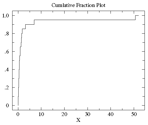
Below is the plot of the cumulative fraction for our control
data. Each step in the plot corresponds to a data-point.

You can see with a glance that
the vast majority of the data is scrunched into a small
fraction of the plot on the far left. This is a sign of a non-normal distribution
of the data. In order to better see the data distribution, it would
be nice to scale the x-axis differently, using more space to display
small x data points. Since all the data are positive you can use a "log" scale.
(Since the logarithm of negative numbers and even zero is
undefined, it is not possible to use a log scale if any of the data
are zero or negative.) Since many measured quantities are guaranteed
positive (the width of a leaf, the weight of the mouse, [H+])
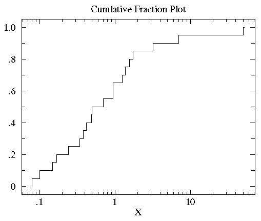
log scales are common in science. Here is the result of using a log scale:

You can now see that the median (the point that divides the
data set evenly into two: half above the median, half below the median)
is a bit below 1.
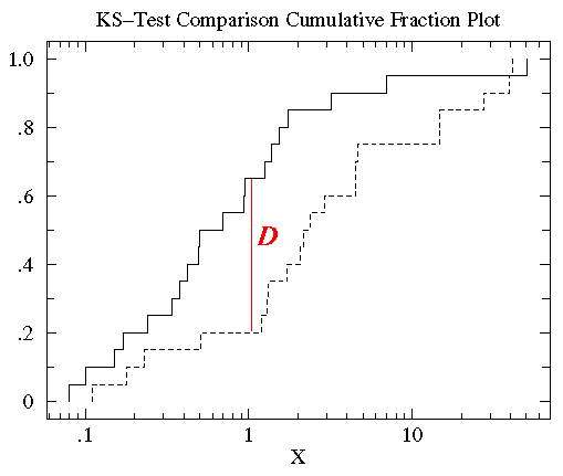
We now plot the cumulative fraction of the treatment group on the same graph
as we plotted the control cumulative fraction. (We'll use a
dashed line to display the treatment group so we can distinguish it from
the control group.)

You can see that the control and treatment datasets span much
the same range of values (from about .1 to about 50). But for most any
x value, the fraction of the treatment group that is strictly less
than x is clearly less than the fraction of the control group that is less than x.
That is, by-and-in-large the treatment values are larger than
the control values for the same cumulative fraction. For example,
the median (cumulative fraction =.5) for the control is clearly
less than one whereas the median for the treatment is more than 1.
The KS-test uses the maximum vertical deviation between the two
curves as the statistic D. In this case the maximum deviation
occurs near x=1 and has D=.45. (The fraction of the treatment
group that is less then one is 0.2 (4 out of the 20 values);
the fraction of the control
group that is less than one is 0.65 (13 out of the 20 values). Thus the maximum difference in
cumulative fraction is D=.45.)
Note that unlike the t-statistic, the value of the D statistic
(and hence the P value) is not affected by scale changes like using log.
The KS-test is a robust test that cares only about the relative distribution
of the data. In the above case, use of the log scales just moved the important
region so the user could see the distribution of the data.
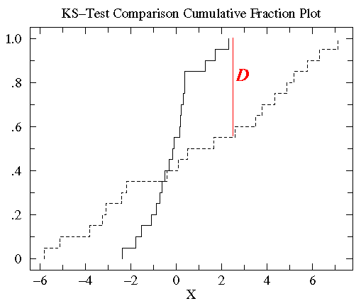
In a similar way we can examine the data in the first example:

Again, with a glance you can see that the treatment group has more variation
than the control group, but a similar median. 100% of the control group is less than 2.31 whereas only 55% of the
treatment group is below 2.31. Thus D=.45, and the corresponding P
value suggests a significant difference.
Percentile Plot
Estimated Distribution Function Ogive
related keyword: Order Statistics
The steps of the cumulative fraction plot look strange to our
eyes: we are used to seeing continuous curves. Of course the
steps are exactly correct: just above a data-point there is
one more included data-point and hence
a bit more cumulative fraction then just below a data-point.
We seek something quite similar to cumulative fraction, but
without the odd steps. Percentile is a very
similar idea to cumulative fraction. If we have a dataset
with five data-points:
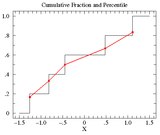
{-0.45, 1.11, 0.48, -0.82, -1.26}
we can sort this data from smallest to largest:
{ -1.26, -0.82, -0.45, 0.48, 1.11 }
The exact middle data-point (-0.45) is called the median, but
it is also the 50th-percentile or percentile=.50. Note that
at x=-0.45 the cumulative fraction makes a step from .4 to .6.
The percentile value will always lie somewhere in the step region.
In general the percentile is calculated from the point's
location in the sorted dataset, r, divided
by the number of data-points plus one (N+1).
Thus in the above example, the percentile for -.45 is 3/6=.5.
In summary:
percentile = r/(N+1)
Thus we have the following set of (datum,percentile) pairs:
{ (-1.26,.167), (-0.82,.333), (-0.45,.5), (0.48,.667), (1.11,.833) }
We can connect adjacent data points with a straight line.
(The resulting collection of connected straight line segments
is called a ogive.)
The below plot compares the percentile plot (red) to the
cumulative fraction.

There are a couple of reasons for preferring percentile
plots to cumulative fractions plots. It turns out that
the percentile plot is a better estimate of the distribution
function (if you know what that is). And plotting percentiles
allows you to use "probability graph paper"...plots with
specially scaled axis divisions. Probability scales
on the y-axis allows you to see how "normal" the data is.
Normally distributed data will plot as a straight line on
probability paper. Lognormal data will plot as a straight line
with probability-log scaled axes. (Incidently uniformly distributed
data will plot as a straight line using the usual linear y-scale.)
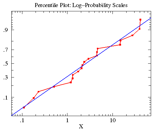
The KS-test reported the treatmentB data in the second example
was approximately lognormal with geometric mean of
2.563 and multiplicative standard deviation of 6.795.
In the below plot, I display the percentile plot of this data
(in red) along with the behavior expected for the above
lognormal distribution (in blue).

Note that the KS-test reports that both treatmentB and controlB
data are approximately lognormal. Thus you could take the log of all
the data, and use the resulting data in a t-test. Since the
t-test is a quite sensitive test when applied to appropriate
data this would be the best strategy.
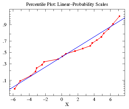
Similar consideration of the treatmentA data in the first example lead to
the following plot. Here the KS-test reported that the data was approximately
normally distributed with mean=.8835 and standard deviation=4.330
(plotted in blue).

A Final Example
Two near-by apple trees are in bloom in an otherwise empty field.
One is a Whitney Crab the other is a Redwell.
Do bees prefer one tree to the other? We collect data by using
a stop watch to time how long a bee stays near a particular tree.
We begin to time when the bee touches the tree; we stop timing when the
bee is more than a meter from the tree. (As a result all our times are
at least 1 second long: it takes a touch-and-go bee that long to get
one meter from the tree.) We wanted to time exactly the same number
of bees for each tree, but it started to rain. Unequal dataset size is not a problem
for the KS-test.
redwell={23.4, 30.9, 18.8, 23.0, 21.4, 1, 24.6, 23.8, 24.1,
18.7, 16.3, 20.3, 14.9, 35.4, 21.6, 21.2, 21.0,
15.0, 15.6, 24.0, 34.6, 40.9, 30.7, 24.5, 16.6,
1, 21.7, 1, 23.6, 1, 25.7, 19.3, 46.9, 23.3, 21.8,
33.3, 24.9, 24.4, 1, 19.8, 17.2, 21.5, 25.5,
23.3, 18.6, 22.0, 29.8, 33.3, 1, 21.3, 18.6, 26.8,
19.4, 21.1, 21.2, 20.5, 19.8, 26.3, 39.3, 21.4,
22.6, 1, 35.3, 7.0, 19.3, 21.3, 10.1, 20.2, 1,
36.2, 16.7, 21.1, 39.1, 19.9, 32.1, 23.1, 21.8,
30.4, 19.62, 15.5}
whitney={16.5, 1, 22.6, 25.3, 23.7, 1, 23.3, 23.9, 16.2, 23.0,
21.6, 10.8, 12.2, 23.6, 10.1, 24.4, 16.4, 11.7,
17.7, 34.3, 24.3, 18.7, 27.5, 25.8, 22.5, 14.2,
21.7, 1, 31.2, 13.8, 29.7, 23.1, 26.1, 25.1, 23.4,
21.7, 24.4, 13.2, 22.1, 26.7, 22.7, 1, 18.2, 28.7,
29.1, 27.4, 22.3, 13.2, 22.5, 25.0, 1, 6.6, 23.7,
23.5, 17.3, 24.6, 27.8, 29.7, 25.3, 19.9, 18.2,
26.2, 20.4, 23.3, 26.7, 26.0, 1, 25.1, 33.1,
35.0, 25.3, 23.6, 23.2, 20.2, 24.7, 22.6, 39.1,
26.5, 22.7}
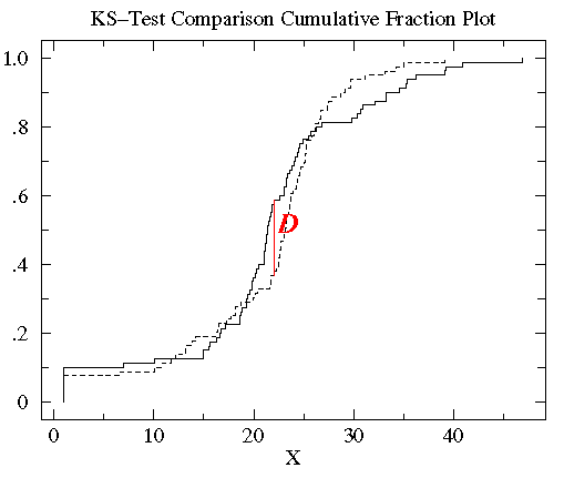
This example is based on data distributed according to the Cauchy
distribution: a particularly abnormal case. The plots
do not look particularly abnormal, however the large number
of outliers is a tip off of a non-normal distribution.
The web page is silent on if this data is normal or lognormal;
that means it finds no evidence for either possibility.
This relatively large sample size can not save the t-test:
it cannot see the difference, whereas the KS-test can. The
t-test is not robust enough to handle this highly
non-normal data with N=80.

Calculation of P from D typically involves approximation.
Different codes use different (but similar) approximations. The code
used here is from Press Numerical Recipes which is in turn based on Stephens (1970)
 , and hence
we'd say that the cumulative fraction of the data smaller
than
  is .85=17/20. For any number x,
the cumulative fraction
is the fraction of the data that is strictly smaller than x.
Below is the plot of the cumulative fraction for our control
data. Each step in the plot corresponds to a data-point.
